Description
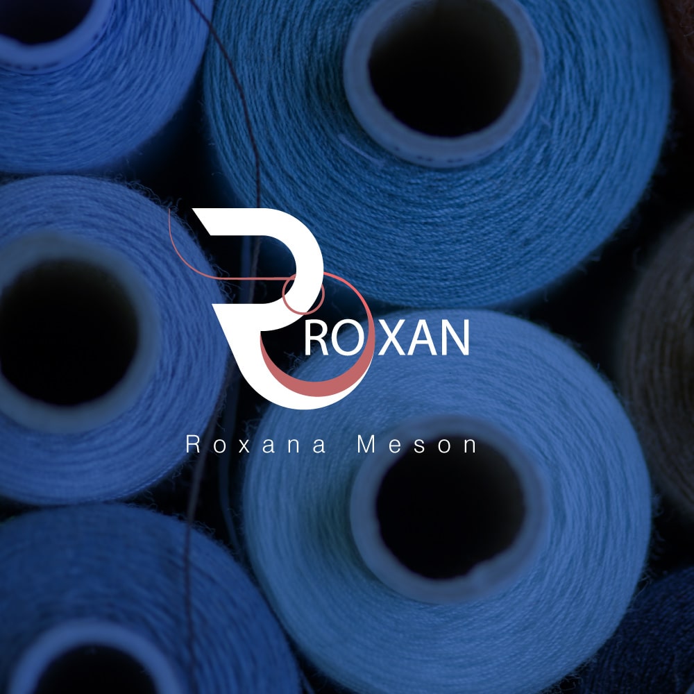
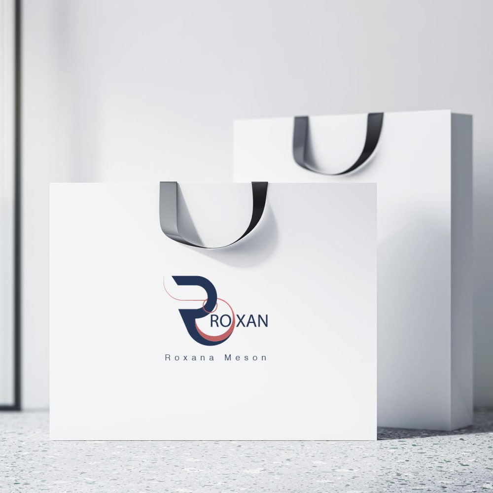
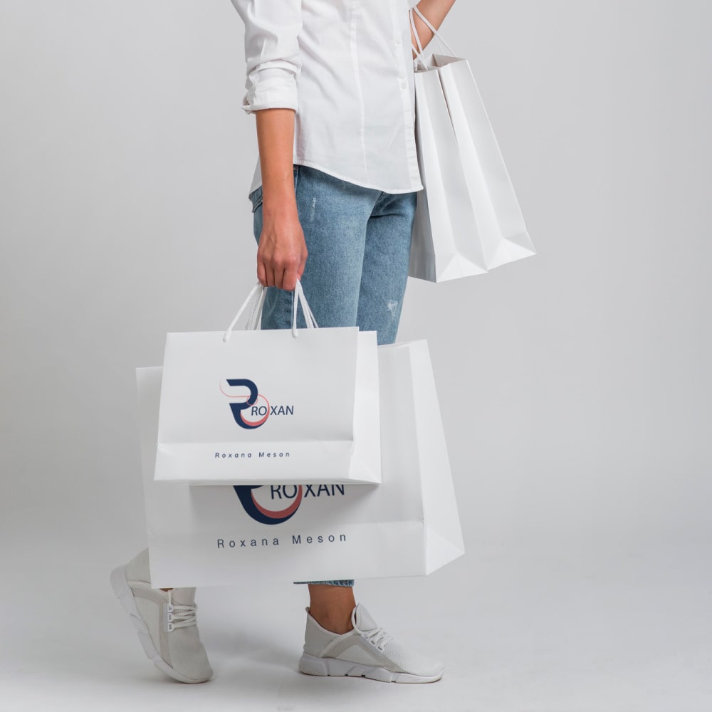
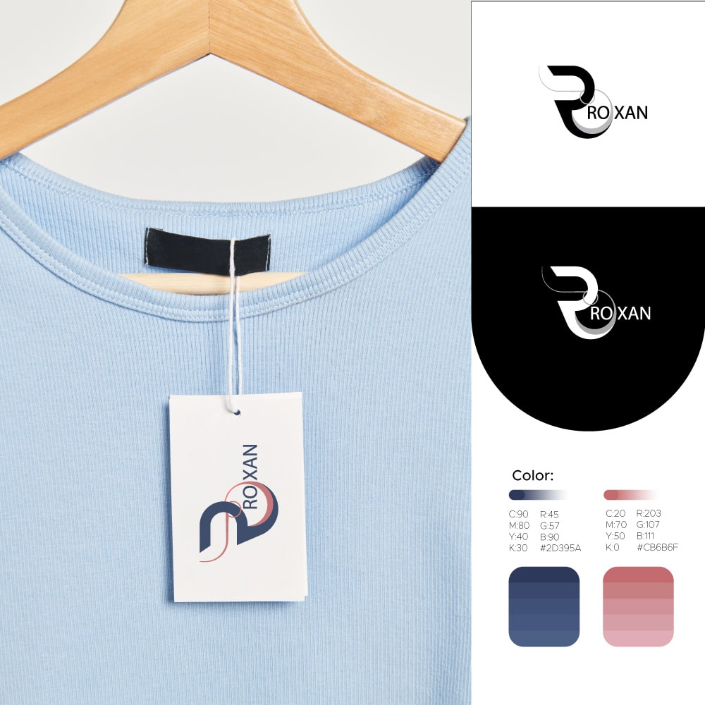
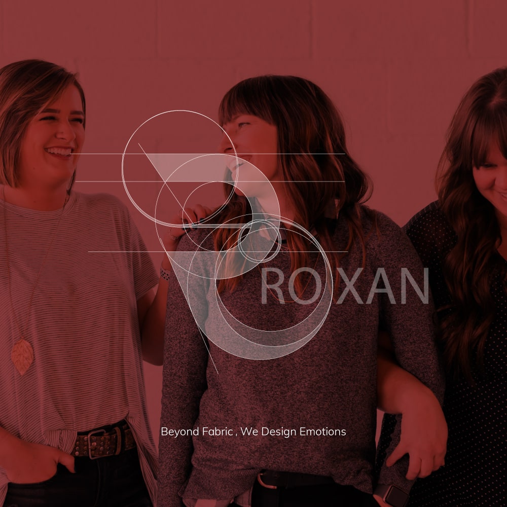
Creating the logo for Roxan was a delightful journey in typography design. The essence of Roxan is beautifully captured in the chosen font, striking a balance between modernity and approachability
The sleek, clean lines of the typography reflect the contemporary style that Roxan embodies, while the friendly curves soften the overall aesthetic, making it relatable to a diverse audience
.In selecting the font for Roxan, I aimed to convey a sense of sophistication without losing the warmth that defines the brand. The letterforms are carefully crafted to evoke a feeling of elegance and creativity, echoing the high-quality and imaginative nature of Roxan's clothing designs. The result is a typography logo that not only visually represents the brand but also invites customers to connect with Roxan on a personal level, where style meets comfort in every stitch.
- ClientRoxan meson
- Design Year2021
- Applicationsillustrator/Photoshop

No comment